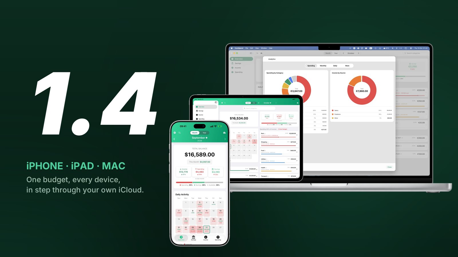
For a year CoreSpend was an iPhone app. A good one, I think, but if you sat down at a Mac to look at the month, the budget was in your pocket, not on the screen. 1.4 fixes that. It is the same app, now on iPhone, iPad and Mac, and the three copies keep each other up to date.
Here is what changed and why.
Three devices, one purchase
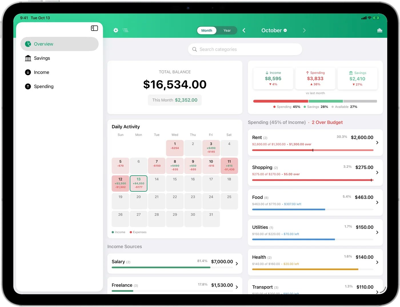
The iPad version is not a stretched phone. It uses the width: a sidebar on the left, two columns on the Overview, and the transaction lists get proper columns for Date, Name, Category and Amount. Keyboard shortcuts work if you have a keyboard attached.
The Mac version is a native Mac app, not a port running in a compatibility box. It has a sidebar, File and View menus, ⌘ shortcuts, a real app icon and desktop widgets. It was built from the same code as the iPhone app, so every number is computed the same way.
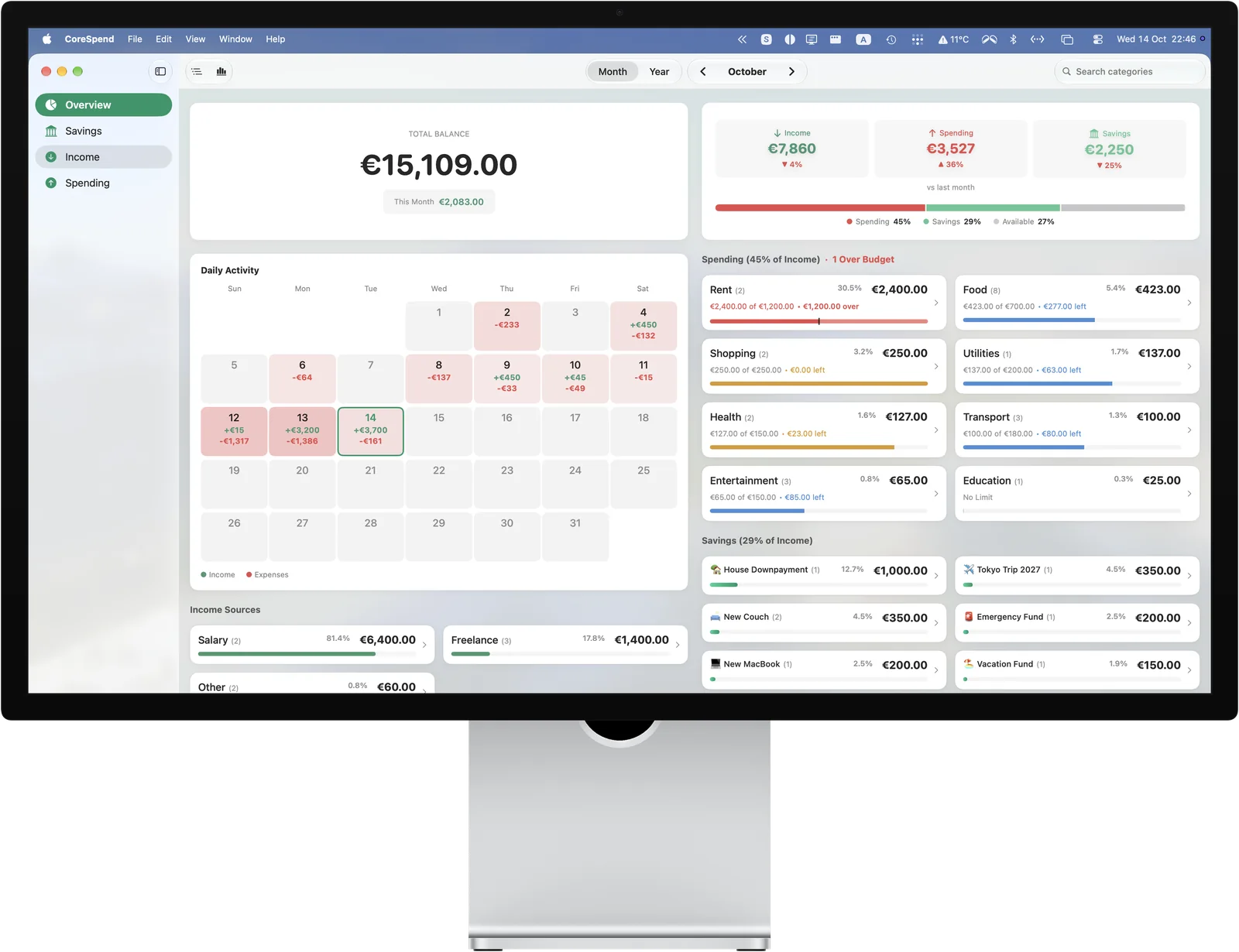
CoreSpend is a universal purchase. Buy it once, on any of the three, and it is yours on the other two. There is no Mac price and no iPad price.
Sync through your iCloud, not through me
This is the part I spent the most time on, and the part you should notice least.
When you are signed into iCloud on your devices, CoreSpend keeps your transactions, budgets, recurring payments and savings goals in step between them. Add a coffee on the phone, and it is on the iPad and the Mac a few seconds later. Change a budget limit on the Mac, and the phone shows it.
A few things are worth saying plainly:
- There is still no account. No email, no password, no sign-up screen. Sync uses the iCloud account that is already on your device.
- I never see your data. It goes from your device to your private iCloud database and back to your other devices. There is no CoreSpend server in between, because there is no CoreSpend server.
- New phone, or a reinstall? Sign in with the same Apple ID and the budget comes back on its own.
- Not using iCloud? Nothing changes. The app works on one device exactly as it did before.
An Overview that explains itself
The Overview is the screen you see most, so it got the most attention.
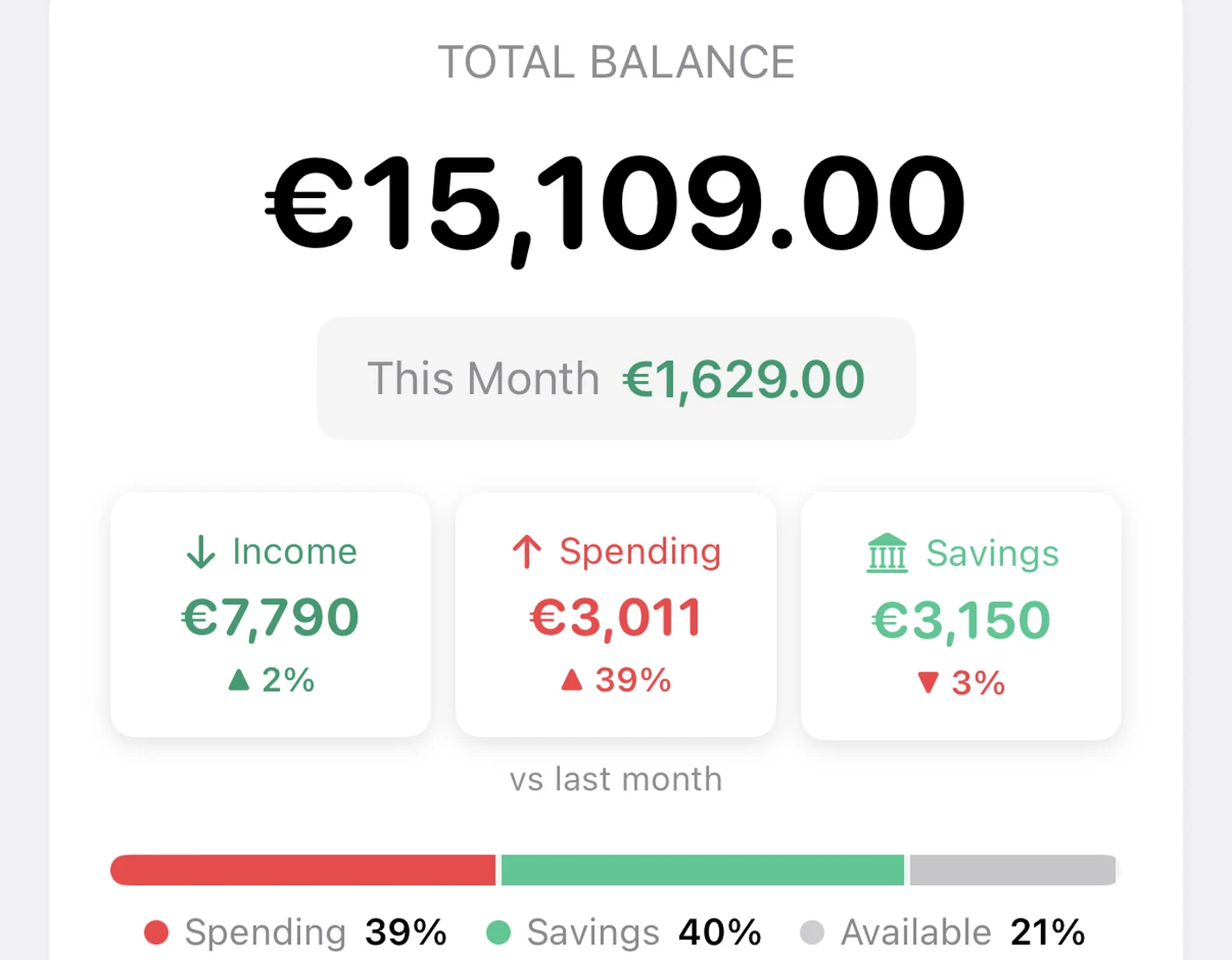
Income, Spending and Savings are now labelled, and each shows how it changed since last month. Under them sits a new bar that answers the question every budget should answer first: where did the income go? Spending, savings, and what is still available.
Budget bars changed colour logic. A category bar is blue while you are comfortably under its limit, amber as you get close, and red once you are over. Over-budget categories move to the top of the list, and the section header says how many there are, so you do not have to scroll to find out.
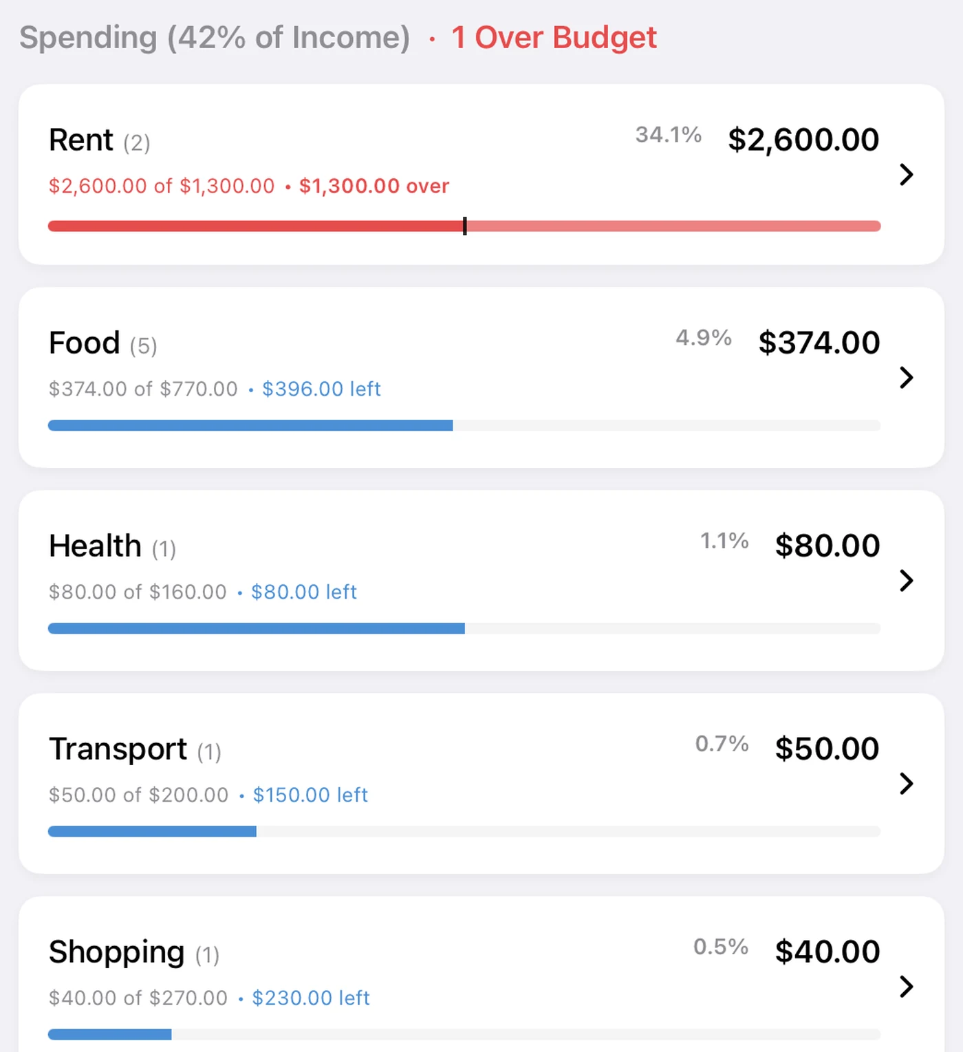
Tap a category and it opens into one box per day, so a day and its transactions read as one unit. There is a search field right on the Overview for the days when you only want to find one thing.
The Overview on iPhone: summary, income split, calendar, then budgets.
The calendar shows the heavy days
Every day in the Daily Activity calendar is now tinted by how much you spent on it. A quiet Tuesday is pale; the day you paid rent is deep red. You see the shape of the month before you read a single number. Tap any day to see its transactions and edit them in place.
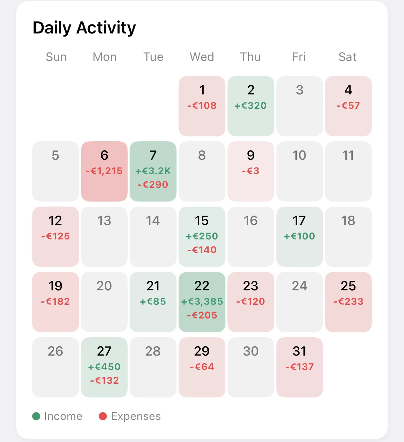
In 1.4.1, which is in testing now, days where more came in than went out turn green instead of red. That is the build in the picture above.
Type the maths
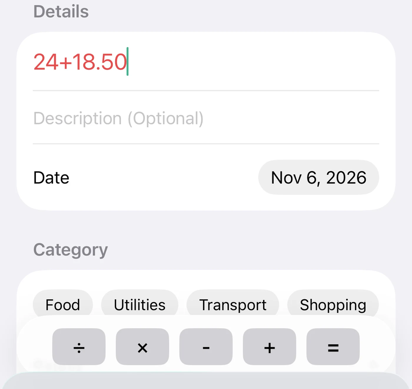
The amount field has had a calculator for a while. What changed is that you no longer have to press =. Type 24+18.50 and hit Save, and CoreSpend stores 42.50. Split a bill, add two receipts, subtract a refund, save.
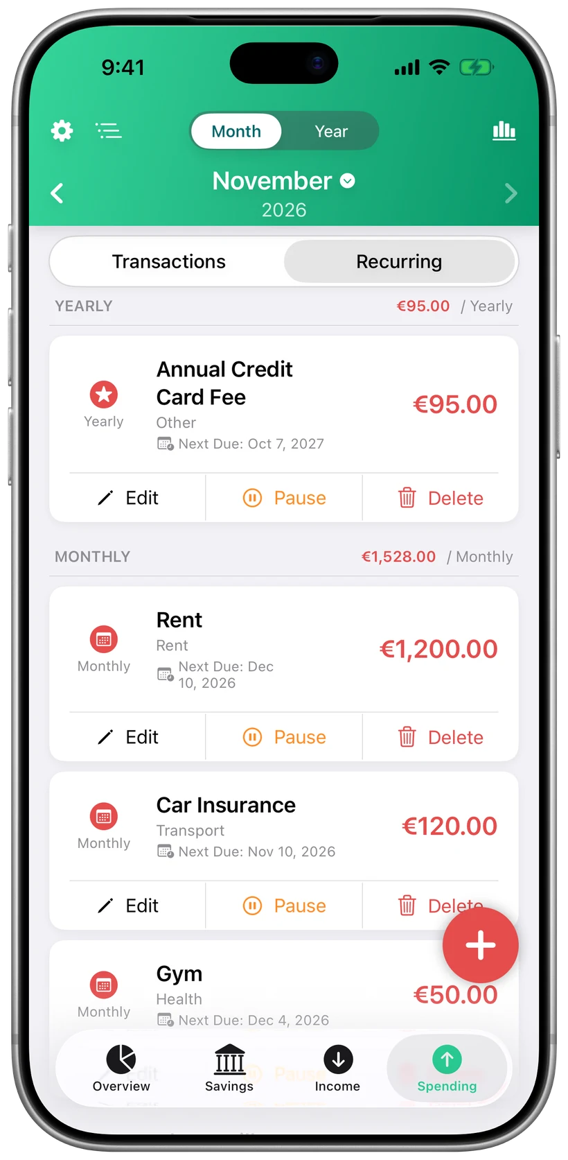
Recurring payments land at midnight
Rent, salary and subscriptions are logged on their due date. Until now they were added whenever you first opened the app that day. Now they are posted at midnight, so the morning Overview is already right, and the transactions they create no longer carry a time, because a rent payment does not happen at 09:41.
Widgets that use the space
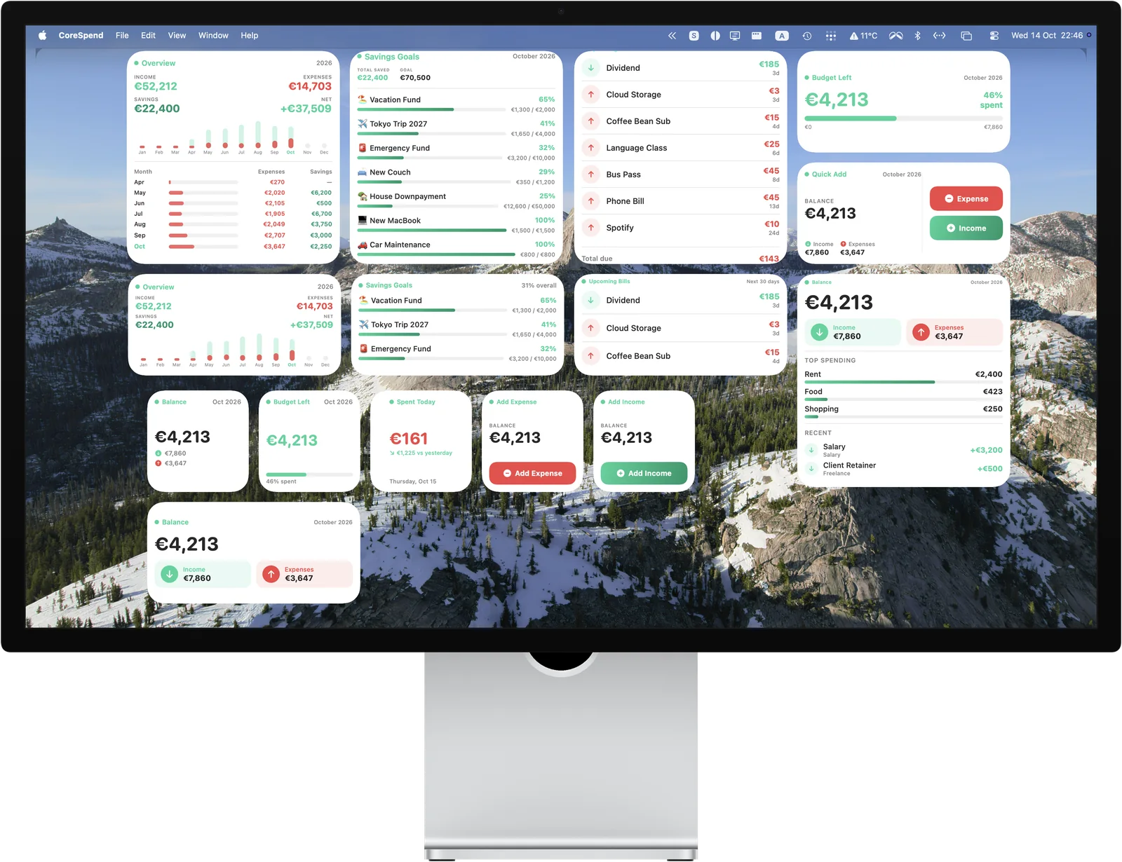
The widgets were rebuilt. Large widgets fill their height instead of leaving a gap at the bottom. Upcoming Bills lists up to seven bills for the next 30 days with the total due. Savings Goals shows active goals first. Balance now shows your latest transactions under the number. Yearly Overview lists every month so far. Today's Spending compares today with yesterday.
Amounts are shown whole unless the cents matter, and currencies that go after the number, like zł and Kč, go after the number in the widgets too.
Home Screen widgets on iPhone. The same set is on iPad and on the Mac desktop.
Savings, summarised
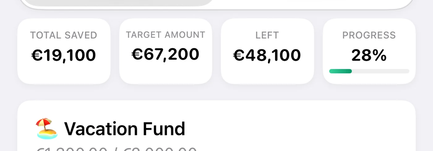
Above your savings goals there is now a summary: Total Saved, Target, Left and Progress. Four cards on iPad and Mac, one compact strip on iPhone. Goal dates are projected from your whole contribution history, including the months you skipped, so the date is honest.
Smaller things
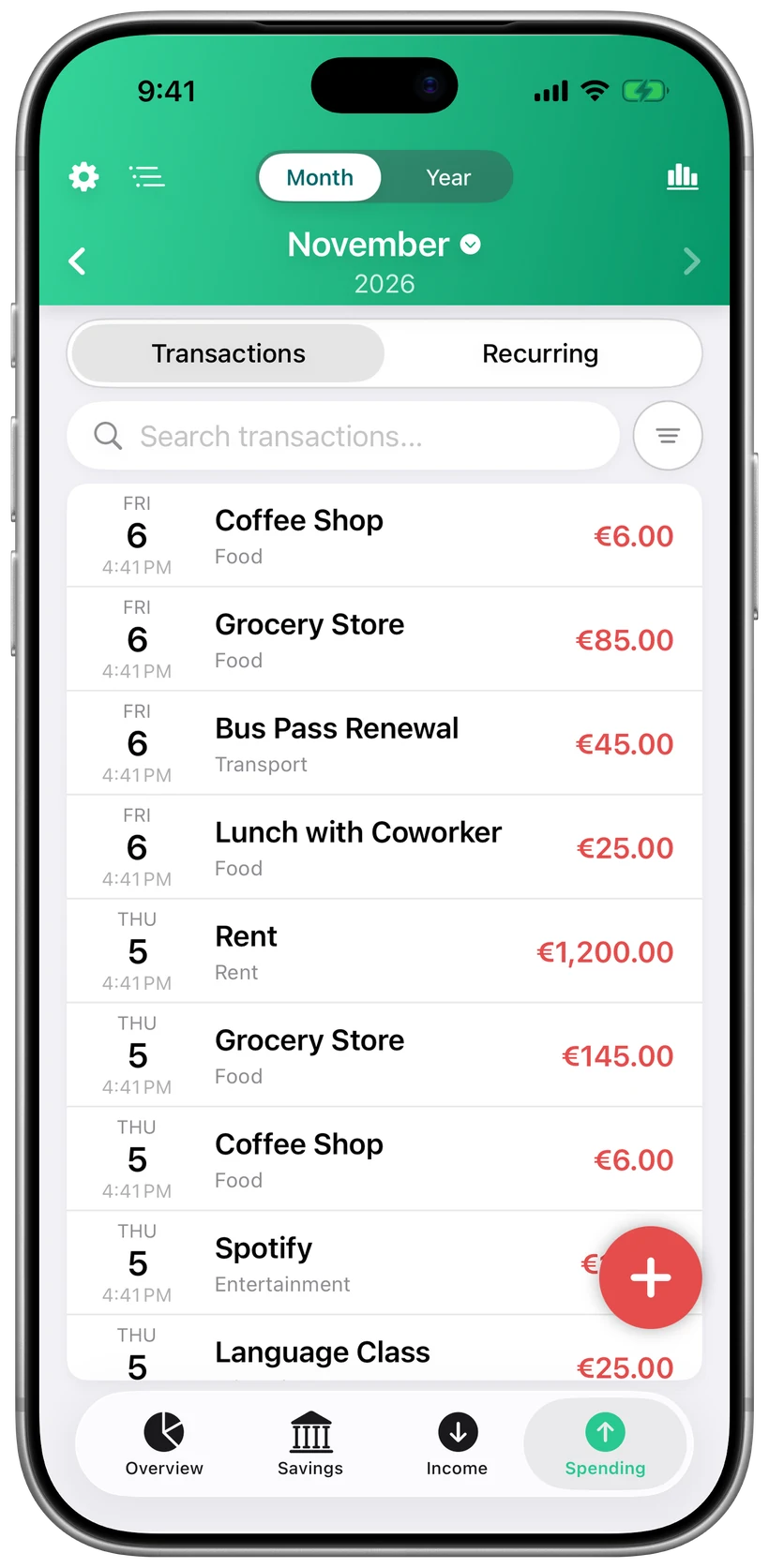
- Income and Spending pages have a Transactions / Recurring switch at the top, the search field with the filter button beside it, and all entries in one card.
- Faster loading when you have years of history.
- More labels translated in all 31 languages, including theme names, Delete, Edit and General.
- Amounts stay on one line in every card, list and chart, even with long currency names.
- Empty calendar days are grey boxes on iPhone and iPad, matching the Mac.
What it costs
The same as before. $0.99, once. The iPad and Mac apps are included, iCloud sync is included, and so is every update after this one. There is no subscription tier and there will not be one.
If something is broken, or something you need is missing, write to me. 1.4.1 is already in progress, and it starts with the things people reported in the first week.